
A dashboard is not a collection of charts or a shorter report. It is an interface for a repeated decision: notice a material change, understand its scale, choose an action and see whether that action helped.
That definition changes the design brief. The first question is not which data is available. It is who must decide what, at which moment, with what evidence and within what authority.
Methodfield uses this working formula:
Dashboard = decision + signal + context + action + feedback.
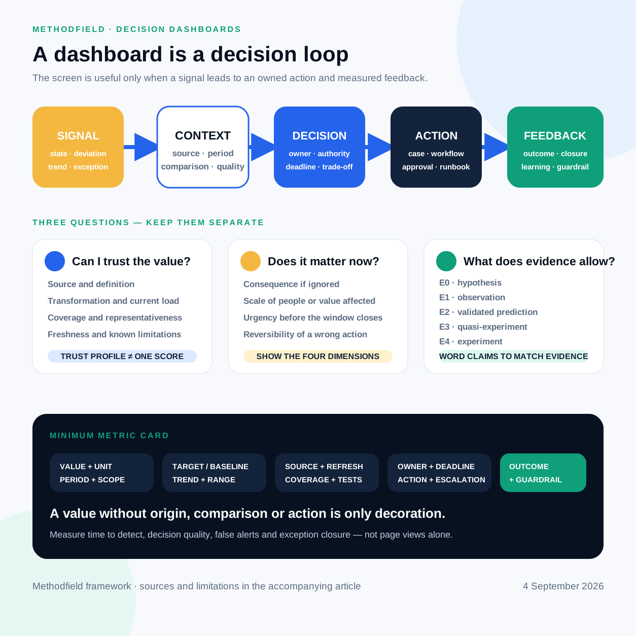
The formula is an original Methodfield synthesis, not an external standard. It is consistent with research that treats dashboards as data-driven decision support systems whose usefulness depends on the user, task and decision environment, not only visual form. Yigitbasioglu and Velcu's literature review (opens in a new tab) also found that direct evidence about dashboard effects was limited. That is a useful warning against universal recipes.
Begin with the decision contract
Before drawing a card, answer seven questions:
- Who owns the repeated decision?
- What event or threshold deserves attention?
- How soon must someone respond?
- Which facts distinguish a real problem from noise?
- Which action is actually available to this user?
- What is the cost of acting and of not acting?
- How will the team observe the result?
The answers also determine the type of dashboard.
| Type | Main horizon | Primary question | Typical content |
|---|---|---|---|
| Strategic | Quarter to year | Are outcomes and risks moving in the intended direction? | Outcomes, targets, forecasts, risks and guardrails |
| Tactical | Week to quarter | Where should attention or capacity move? | Funnel, backlog, segments, capacity and initiatives |
| Operational | Seconds to days | What requires a response now? | State, exceptions, queues, SLA or SLO and owners |
| Analytical | On demand | Why did this happen and what should we test? | Cohorts, comparisons, distributions and drill-down |
| Embedded | At the point of work | What should I do with this case? | Object context, recommendation, action and outcome |
Do not compress all five modes into one page. The board needs direction and consequence; an operator needs exceptions and a next step; an analyst needs exploration. Microsoft describes a Power BI dashboard as a single-page overview leading to underlying reports, while Tableau starts its design guidance with purpose and audience. These are product-specific conventions, but the division between monitoring and investigation is useful. Power BI design guidance (opens in a new tab), Tableau dashboard guidance (opens in a new tab)
The information every important signal needs
State
Show the current value, unit, observation period and whether that period is
closed or still accumulating. Add its status relative to an approved target,
limit or normal range. 18% without a denominator or time boundary is not a
decision signal.
Comparison
Use a comparison that matches the decision: a target, baseline, equivalent season, prior closed period, control group or expected range. A flattering comparison is not an informative comparison. A 12% revenue increase may be irrelevant if margin, returns or cash collection deteriorated.
Trend and uncertainty
One point cannot distinguish variation from a persistent change. Show the relevant history, known interventions and a confidence or prediction interval where it is justified. Separate observed values from estimates and forecasts. For waiting time, a median and upper percentile may reveal what an average hides.
Drivers and segments
Offer only the diagnostic cuts that can change the next action: product, region, channel, cohort, process stage, cause category or owner. A segment that no user can influence may belong in analysis, not on the primary screen.
Exceptions and action queue
Connect an aggregate to the actual orders, customers, incidents or metrics that require a response. Each exception needs a priority, inclusion reason, owner, response deadline and link to the working object. Otherwise the dashboard merely announces work that users must locate elsewhere.
Data origin and quality
For a critical metric, make these details directly available:
- system of record and technical source;
- time of the last successful refresh;
- coverage of expected records;
- current data-test status;
- metric definition and version;
- data owner;
- lineage or transformation description;
- known limitations.
W3C PROV defines provenance as information about the entities, activities and people involved in producing data, useful for assessing quality and trust. W3C PROV overview (opens in a new tab) The UK Government Data Quality Framework separates completeness, uniqueness, consistency, timeliness, validity and accuracy. A pipeline can finish on time while loading only 62% of branches; freshness is not completeness. Government Data Quality Framework (opens in a new tab)
Owner and next action
A red state is not an operating agreement. State who responds, by when, what they check, where they act, when to escalate and what closes the case.
A minimum metric card
Consider an Overdue orders card:
| Field | Example |
|---|---|
| Value | 184 open orders |
| Scope | Snapshot at 09:00, Europe/Lisbon |
| Comparison | +37 day on day; operating limit 120 |
| Scale | €286k revenue; 91 customers |
| Trend | Rising for four consecutive days |
| Freshness | ERP 08:52; carrier API 08:41 |
| Coverage | 99.2%; one warehouse export delayed |
| Confidence | High for ERP status; medium for promised carrier date |
| Owner | Head of fulfilment |
| Action | Open the queue of 28 high-risk orders |
The compact card can show only part of this. The rest should open without a search through documentation.
Trust is a profile, not one percentage
Assess at least five independent questions.
Source: did the observation come from the authoritative system, a manual
sheet, an external provider or a model? A transaction is not automatically
semantically correct: shipped can mean label created, handed to carrier or
physically dispatched.
Definition: do teams agree what an active customer is, which timezone closes a day and how returns, taxes and duplicates are handled?
Transformation: which joins, filters, aggregations, conversions and manual adjustments produced the value?
Current load: did executable checks pass for required fields, ranges, unique keys, volume, reconciliation, freshness and schema changes? Great Expectations calls an expectation a verifiable assertion about data; dbt tests, SQL, Deequ or a custom framework can implement the same principle. Great Expectations documentation (opens in a new tab)
Representativeness: does the loaded sample reflect the real population? Perfectly processed survey responses can still exclude the least satisfied customers.
Also label the value itself: measured, calculated, estimated, forecast or AI-explained. These statuses require different checks.
Do not confuse importance, predicted effect and causal evidence
Three ideas often collapse into one colourful score.
Signal importance asks what happens if nobody responds. Show consequence,
affected scale, urgency and reversibility separately. A synthetic impact 83
hides judgment behind false precision.
Expected action effect is a forecast. It needs assumptions or a model, range, calculation date and owner.
Causal impact asks whether the action produced the outcome. Monitoring a change does not establish attribution. Robust evaluation usually needs a defensible counterfactual: a comparable or randomised control, a quasi-experiment or another design suited to the decision. HM Treasury impact-evaluation guidance (opens in a new tab)
Methodfield uses a transparent evidence ladder:
| Class | What is known | Safe wording |
|---|---|---|
| E0 hypothesis | A mechanism is proposed by a person or AI | Possible explanation |
| E1 observation | A temporal or segment relationship is visible | Associated with |
| E2 validated prediction | A model has passed an out-of-sample test | The model estimates |
| E3 quasi-experiment | A reasoned counterfactual exists, with limits | Probable contribution |
| E4 experiment | Randomisation or another strong causal design | Measured causal effect |
This is an editorial control scale, not an industry standard. Its purpose is to stop an E0 AI narrative from looking as authoritative as an E4 result.
Visual rules follow the decision
- Keep the critical state and next step visible in the primary attention area.
Stephen Few's
at-a-glanceprinciple does not forbid every scroll; it keeps monitoring distinct from a long report. Dashboard Confusion (opens in a new tab) - Use position and length for precise comparisons before area, gauge or decorative form. Use lines for trends, bars or dots for categories, scatter plots for two continuous variables, and tables for exact values.
- Keep scales honest and show
nwhen a percentage has a small denominator. - Make the selected period and filters visible; every filter adds another state that can be misread.
- Do not rely on colour alone. Provide text, shape or pattern, keyboard access, focus, contrast, reflow and a data alternative for material charts. WCAG 2.2 (opens in a new tab)
- Design a smaller mobile decision, not a microscopic desktop dashboard. Tableau's device layouts illustrate the principle. Tableau device guidance (opens in a new tab)
Pair targets with guardrails
A target invites optimisation. Pair it with the most likely way to improve the number while damaging the system.
| Target metric | Harmful shortcut | Guardrail |
|---|---|---|
| Response speed | Superficial closure | Repeat contact; verified resolution |
| Conversion | Sell to unsuitable customers | Returns; complaints; retention |
| Feature output | More defects and complexity | Incidents; adoption; cost to serve |
| Automation rate | Hidden manual correction | Override rate; exception backlog |
| Revenue | Discounts and weaker margin | Contribution margin; cash collection |
Kaplan and Norton argued that financial measures alone were insufficient and should be balanced by connected perspectives. Campbell's classic work explains why a quantitative indicator becomes vulnerable to distortion when it carries high decision pressure. Neither source supplies a universal KPI set; both explain why metric systems shape behaviour. Balanced Scorecard (opens in a new tab), Campbell, 1979 (opens in a new tab)
Evaluate the dashboard as a decision system
Before launch, test whether a representative user can identify the state, notice a material exception, interpret period and source, find a driver and choose the correct next action. After launch, monitor time to detect, time to decision, acted-on signals, false and missed alerts, exception closure time, manual recalculation, conflicting definitions and use at the intended moments.
Page views are not impact. A good operational dashboard may be opened rarely because an alert leads directly to the exception. A bad one may remain open all day because someone must watch it. Google SRE explicitly warns against making a person stare at a screen waiting for trouble. Google SRE monitoring guidance (opens in a new tab)
Review one card today
Take one critical card and ask: which decision does it change; who may decide; how is the metric defined; which period and timezone apply; what is the comparison; when did the data refresh; what was covered; which system is authoritative; what are consequence, scale, urgency and reversibility; how strong is the causal evidence; and where does the user act?
If half the answers are missing, the immediate problem is not the colour palette. Build the metric and decision contract first.
Sources
Primary and authoritative sources are linked beside the relevant claims. The main references are:
- Yigitbasioglu and Velcu — dashboard literature review (opens in a new tab).
- W3C PROV Overview (opens in a new tab).
- UK Government Data Quality Framework (opens in a new tab).
- HM Treasury — Quality in Policy Impact Evaluation (opens in a new tab).
- W3C Web Content Accessibility Guidelines 2.2 (opens in a new tab).
- Google SRE — Monitoring Distributed Systems (opens in a new tab).
The decision-loop formula and E0–E4 evidence labels are original Methodfield editorial tools. They are not external standards or compliance claims.
Discuss your workflow
Choose one repeated decision and one metric card. Bring its current definition, source, owner and the action it is expected to trigger. That is enough to map the first decision contract and identify where the dashboard currently relies on assumption rather than evidence.
Continue with the data architecture and platform selection guide, then the guide to AI in dashboards.