
A known BI product does not make a dashboard trustworthy. Trust is produced by the full path: capture, delivery, modelling, tests, definitions, permissions, refresh, presentation and operations.
The user sees a number. Behind it sits a system:
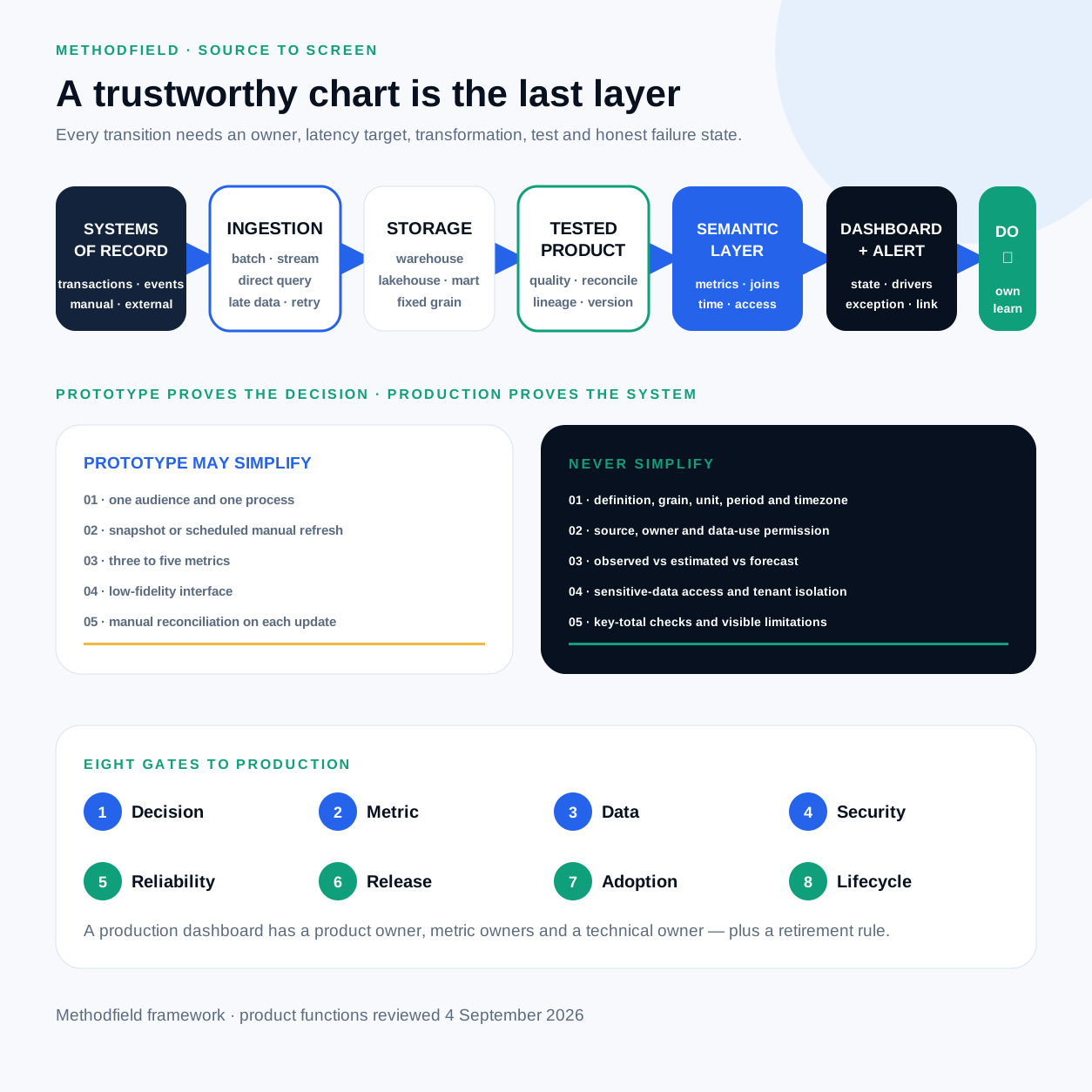
An error in any layer can become a persuasive chart. Matching a tile to one SQL query proves only that the tile repeats the query; the query may still count the wrong business object or run over an incomplete source.
1. Inventory what the organisation observes
For every material metric, record:
- the system of record and technical source;
- accountable owner and steward;
- how a record appears: transaction, event, sensor, manual entry, survey, external provider or model;
- event time and processing time;
- keys, grain, timezone, currency and units;
- correction, deletion and retention rules;
- available history, licence and privacy conditions.
The system of record and query source can differ. A warehouse may serve the dashboard while the ERP remains authoritative. The warehouse should be a reconciled analytical representation, not a second silent register.
| Source class | Strength | Typical risk | Expose to the user |
|---|---|---|---|
| Transaction system | Records completed operations | Status has local meaning | System of record; replication lag |
| Event stream | Speed and detail | Duplicates, loss, schema changes | Window, coverage, sampling |
| Manual input | Expert context | Delay, inconsistency, error | Author, date, approval state |
| Survey | Direct perception signal | Selection and non-response bias | n, response rate, period |
| External provider | Rapid market data | Method and revision outside control | Provider, version, retrieval date |
| Predictive model | Forecast or classification | Drift, bias, poor calibration | Version, interval, evaluation date |
| Generative AI | Flexible explanation | Plausible error and variability | AI label, grounding and review |
Quality is always fit for purpose. A daily planning source may be perfectly adequate for a monthly review and too late for an operational intervention. UK Government Data Quality Framework (opens in a new tab)
2. Choose delivery by decision latency
Batch is often the simplest, most reliable choice for financial, commercial and management metrics. Define the last successful refresh, expected completion, late-arriving data, backfill, idempotency and the treatment of an open period.
Streaming or near real time suits fraud, infrastructure and physical
operations, but needs event ordering, deduplication, watermarks, gap detection
and latency measurement. A fast provisional signal with 82% coverage can be
more honest than a green live indicator.
Direct query or live connection reduces copying delay but couples dashboard availability and performance to an operating system. It needs query limits, caching, read replicas, workload isolation and a clear timeout state.
Refresh every 15 seconds only when the decision can use that speed. Real time is not a quality attribute by itself.
3. Model the business object
A prototype with one source can use a prepared table. Reused metrics across systems normally need a governed warehouse or lakehouse and reproducible transformation.
Fix the grain first: is one row an order, an order line, an event or a daily snapshot? Then define dimensions, historical changes, joins, currency conversion, returns and the business calendar. Microsoft's Power BI guidance uses star schema to separate dimensions used for filtering and grouping from facts used for summarisation; facts should have a consistent grain. The principle is portable even when the exact model is not. Microsoft star-schema guidance (opens in a new tab)
A wide table is not inherently wrong. It becomes dangerous when it multiplies amounts through one-to-many joins, mixes grains, loses historical state or hides deduplication rules. A denormalised mart is useful when its contract is explicit and tested.
4. Test the path, not only the final chart
Use four layers of control.
Technical tests: pipeline completion, schema contract, volume ranges, unique keys, required values, domain ranges and freshness.
Semantic tests: reconciliation to source totals, consistent status meaning, correct return treatment, timezone closure and stable denominators.
Business reconciliation: finance, operations or another accountable owner checks samples and totals against known records. Automation can test a rule only after the organisation agrees the rule.
Lineage and impact analysis: show which jobs and datasets produced the
metric, and which downstream objects a change will affect. W3C PROV supplies a
general provenance model; OpenLineage specifies job, run, dataset and
input/output events. Lineage makes calculation traceable but cannot prove that
the business definition is correct.
W3C PROV (opens in a new tab),
OpenLineage specification (opens in a new tab)
Data expectations should be executable. Great Expectations is one example; dbt tests, Deequ, SQL or an internal framework can implement the same idea. Great Expectations (opens in a new tab)
5. Give each business term one governed meaning
A semantic layer separates business language from physical tables. Define:
- measures, dimensions and allowed aggregations;
- relationships and approved join paths;
- time semantics;
- access rules;
- descriptions, synonyms, ownership and certification status.
LookML, for example, describes dimensions, aggregates, calculations and
relationships, then Looker generates SQL from the model. Power BI semantic
models provide reusable definitions for reports and AI features. These are
vendor implementations of a general requirement: Revenue must not fragment
into hidden formulae inside individual tiles.
LookML introduction (opens in a new tab)
The semantic layer can start as version-controlled SQL models and metric contracts. It does not have to be a separate purchased product.
6. Separate dashboard, alert and workflow
The dashboard supports state and investigation. Alerting captures attention. The workflow performs the action.
Threshold or anomaly
        ↓
Notification with context
        ↓
Dashboard state and drivers
        ↓
Ticket / CRM object / runbook / approval
        ↓
Outcome and closure reason
When a response is urgent, the alert should lead to the exact state and runbook. A person should not have to stare at a wall display to discover a critical event. Google SRE's monitoring guidance distinguishes symptoms from causes and highlights latency, traffic, errors and saturation for services; the specific signals differ for business operations, but the layered logic holds. Google SRE (opens in a new tab)
Platform choices in 2026
This is a fit map, not a ranking. Product functions and licences change; the linked official documentation was reviewed on 4 September 2026.
| Product or approach | Natural fit | Question before selection |
|---|---|---|
| Excel / Google Sheets | Fast hypothesis and small-team prototype | Who controls versions, access and manual edits? |
| Power BI / Microsoft Fabric | Enterprise BI in the Microsoft ecosystem | Are capacity, DAX modelling and administration covered? |
| Tableau / Tableau Pulse | Visual exploration and governed metric distribution | How are certified sources and licences governed? |
| Looker | Code-defined metrics and embedded analytics over a SQL warehouse | Can the team maintain LookML, Git and the warehouse? |
| Grafana | Operational monitoring over metrics, logs, traces and time series | Is the job observability or enterprise BI? |
| Metabase | Accessible BI and embedding, including self-hosting | Which security, SSO and embedding needs require a paid plan? |
| Apache Superset | Open-source, SQL-first analytics | Who owns hosting, upgrades, security and user experience? |
| Custom application | A unique decision and action inside the product | Does the workflow justify continuous engineering cost? |
Official product material confirms these different emphases: Grafana composes panels from data sources for operational views; Metabase builds dashboards from saved questions and offers several embedding modes; Superset combines a no-code chart builder, SQL IDE and lightweight semantic layer. Grafana dashboards (opens in a new tab), Metabase dashboards (opens in a new tab), Apache Superset (opens in a new tab)
Do not compare chart counts. Run the same proof of concept: one difficult metric, two cuts, real access restrictions, row or column security, expected concurrency, drill-through, mobile and accessibility, dev–test–prod promotion, rollback, audit, lineage, alerting or embedding, and total operating cost.
What a prototype may simplify
A prototype tests whether information improves a decision. It may use one
process, one audience, a snapshot, a manual refresh, three to five metrics, a
low-fidelity wireframe and manual reconciliation. Mark it prototype — not for operational decisions.
Do not simplify the metric definition, unit, period, timezone, source, owner, fact-versus-forecast distinction, sensitive-data controls or key-total checks. A prototype built only on perfect synthetic data tests layout, not the product.
Eight gates to production
- Decision: named audience, repeated decision, owner and use moment; users complete task-based tests.
- Metric: approved formula, grain, dimensions, exclusions, target, guardrails, owner and version.
- Data: authorised source, reproducible pipeline, reconciliation, automated quality rules, visible freshness and coverage.
- Security and privacy: least privilege, row and column controls, tenant isolation, exports, audit and retention. A visible filter is never an authorisation boundary. Metabase embedding security (opens in a new tab)
- Reliability: refresh SLO, load target, caching, timeout, incident owner and honest stale, partial and unavailable states.
- Release: dev/test/prod, review for SQL and semantic changes, test data, release notes and rollback. A formula change is versioned.
- Adoption: the dashboard lives in a meeting, alert, daily workflow or product; users understand the metrics and feedback route.
- Lifecycle: review dates and removal criteria; unused and duplicated dashboards are archived.
Operate and retire the product
At every refresh, observe pipeline state, freshness, coverage, critical tests, reconciliation, alert delivery and query errors. Each work cycle, review acted-on signals, false or missed alerts, manual workarounds, performance, costs and unanswered user questions. Each month or quarter, revisit targets, definitions, access, outcome evidence and candidates for deletion.
A production dashboard needs a product owner, metric owners and a technical
owner. An analyst built it describes history, not an operating model.
Map one critical metric from business event to decision. Name the owner, latency, transformation, test and failure state at each transition. If the path depends on an undocumented spreadsheet or one person's memory, the next step is a reproducible data product and metric contract—not another chart.
Sources
The architecture and current product descriptions rely on primary standards and official product documentation. Main references:
- UK Government Data Quality Framework (opens in a new tab).
- Microsoft — star schema guidance (opens in a new tab).
- W3C PROV Overview (opens in a new tab) and the OpenLineage specification (opens in a new tab).
- LookML introduction (opens in a new tab).
- Grafana dashboards (opens in a new tab), Metabase dashboards (opens in a new tab) and Apache Superset (opens in a new tab).
Vendor documentation establishes how a vendor's product works; it is not used as independent proof that the product is more effective than another. Product availability, licences and prerequisites should be checked again when buying.
Discuss your workflow
Select one critical metric and trace it from the business event to the decision. For each transition, name the owner, latency, transformation, test and failure state. The result is a small source-to-action map suitable for a platform proof of concept and production-gap review.
Continue with how AI changes dashboard creation and operation, or return to the information and evidence model.